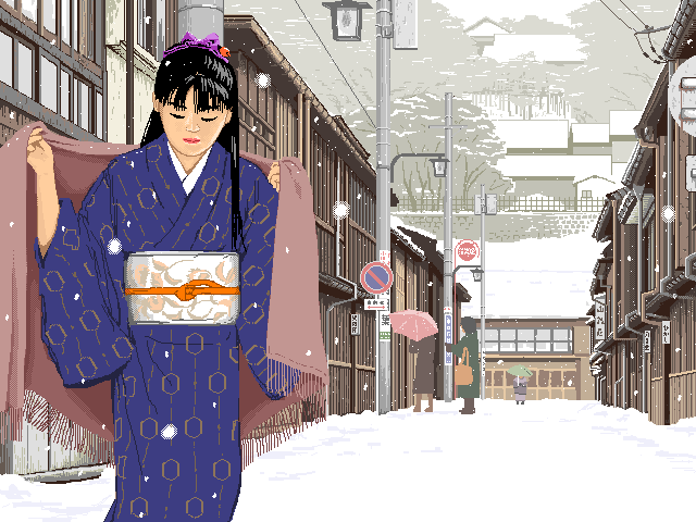
これはかなり珍しい例かと思います。
この絵はIBM-PCの256色モードで製作されていますが、256色のパレット上で、絵の要素に合わせて色をいくつかのグループに分けることによって、遠景、近景、人物など、それぞれの色の調子を別々に整えるということをしています。この絵では、遠くへ行くほど色の彩度を落としていくことによって、雪景色の遠近感を出そうとしました。
使用ソフト:自作のペイントソフト(MS-DOS版)
I think this is a fairly rare case.
This painting was created using the 256-color mode of the IBM-PC. On the 256-color palette, the colors were divided into several groups according to the elements of the painting, such as distant view, near view, people, and the tone of the colors of each group were adjusted individually. In this painting, I tried to create a sense of perspective in the snowy landscape by decreasing the saturation of the colors as the elements get farther away.
Software used : Paint software for MS-DOS developed by myself
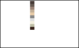
 この絵の256色パレットです。色の並びは左上から下に向かって順番に並んでいます。左上角が0、左下角が15、右下角が255です。
This is the 256 color palette for this painting. The colors are arranged in order from top left to bottom. The top left corner is 0, the bottom left corner is 15, and the bottom right corner is 255.
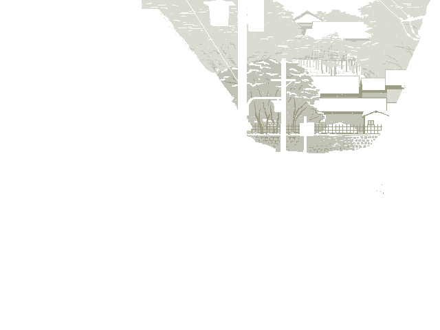
絵の要素は次の4つに分かれています。パレットを操作し、各要素の色だけを残してそれ以外の色を消してみると次のようになります。
The elements of the painting are divided into four groups. By manipulating the palette, if only the colors in each group remain and the other colors become white, it will look like the following.
(色番号 0-63)(Color number 0-63)


(色番号 64-95)(Color number 64-95)
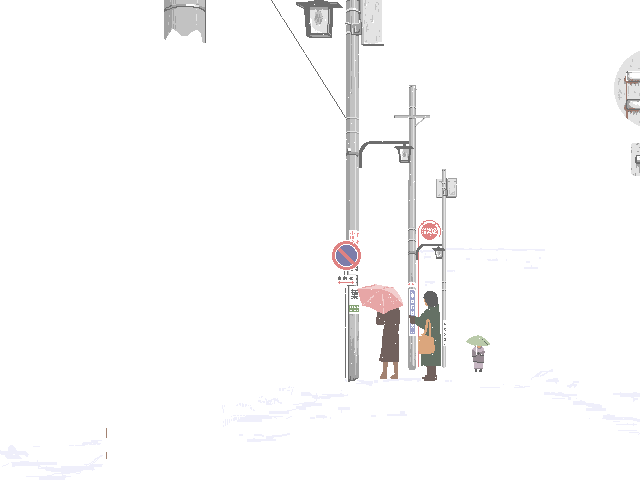

(色番号 96-111)(Color number 96-111)

(色番号 112-127)(Color number 112-127)
通常日本で使われているグラフィックモードは、PC98シリーズの16色モードか、そうでなければMac,X68,TOWNSなどの32000色以上がほとんどで、直接256色モードでディジタルペインティングを行っている人は非常に少ないのではないかと思います。(ただし米国などのIBM-PCの世界では、256色のディジタルアートもけっこう見かけます。)
16色で絵を描く場合と、フルカラー(32000色~1670万色)で絵を描く場合とでは、方法論が全く違いますが、では256色ではどうなのだろう?というのがこの例です。
16色の場合と同じように、あらかじめ必要な色をパレット上に作ります。16色の場合と違い、中間色を出すのにタイルパターンを用いる必要はありません。
The graphics mode normally used in Japan is the 16-color mode of the PC98 series, or the 32,000 or more colors of Mac, X68, TOWNS, etc., and I think there are very few people who create digital paintings directly in the 256-color mode. (However, in the IBM-PC area such as the United States, 256-color digital art can be seen quite a lot.)
The methodology for creating pictures with 16 colors is completely different from that with full color (32,000 to 16.7 million colors), but what about 256 colors? This is an example.
As with the 16 colors, create the colors we need on the palette in advance. Unlike the 16-color case, we don't need to use tile patterns to create neutral colors.
また、16色、256色などのインデックスカラー画像の面白いところは、パレットの色を操作することで、自由に色が変えられることです。この女性の来ている着物の色なども、えんじにしてみたり鶯色にしてみたり、いろいろ遊べます。
Also, the interesting thing of index color images such as 16 colors and 256 colors is that you can freely change the colors by manipulating the palette. You can enjoy changing the color of this woman's kimono to other colors such as dark red or dark yellow.
 着物の色(色番号 17)をえんじ色に変更した例 Example of changing the color of kimono (color number 17) to dark red